How did you attract/address your audience?
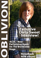
In my magazine I attract my target audience by putting the masthead down the side because it breaks conventional layout of the magazine. I did this because the audience I am targeting generally don't follow the rules of convention and dress and act individually which is why i put the masthead down the side to make it different to others. I laid out my front cover and contents pretty simple and this was because people who would read this sort of magazine prefer simply laid out work and so that it isn't complicated like a lot of magazines are. Also the colour scheme of the magazine is natural which is what my audience want, they wouldn't want garish colours because its not targeted at young people, its targeted at a mature audience who just want real information with basic natural colours, not garish coloured magazines with lots of gossip and childish talk.

In the double page spread I used a mixture of sophisticated language and mature slang because my audience is of a mature nature. They would want a mixture of them both instead of gossip magazines which have a mixture of childish slang/abbreviations and simple words. By doing this it has targeted my audience perfectly and it will definitely help to sell my magazine. Also on my double page spread I used natural colours instead of garish colours as explained in my paragraph before. The colour of the font is a basic white because I didn't want it to be bright colours etc I just want it to be simple and easy to read.

On contents page I laid it out pretty simply but with it more interesting then it just being all together and boring. I kept with the same colour scheme as the front cover and double page spread so that it went with each other and so that it didn't look unusual and just a mess of random colours. Also I used a relaxed photo is what my audience wants , not an in your face picture that makes you think what the hell is going on which sometimes puzzles readers.
 In my magazine I attract my target audience by putting the masthead down the side because it breaks conventional layout of the magazine. I did this because the audience I am targeting generally don't follow the rules of convention and dress and act individually which is why i put the masthead down the side to make it different to others. I laid out my front cover and contents pretty simple and this was because people who would read this sort of magazine prefer simply laid out work and so that it isn't complicated like a lot of magazines are. Also the colour scheme of the magazine is natural which is what my audience want, they wouldn't want garish colours because its not targeted at young people, its targeted at a mature audience who just want real information with basic natural colours, not garish coloured magazines with lots of gossip and childish talk.

No comments:
Post a Comment