 |
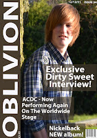
| Music Magazine Front Cover |
 |
| College Magazine Front Cover |
 |
| College Magazine Contents |
blended into the picture right by changing the opacity
 |
| Music Magazine Contents |
I also learnt how to combine two layers to make the pictures colour look better because in my music magazine contents page, the picture is double layered. The bottom layer is the photo in black and white and then the second one is in colour so then I used the opacity tool to blend the colours to make it look better then what it was previously. the original images colours were just too strong so by doing it double layered and adjusting the opacity it gave me the colour blend that I wanted and needed to make the picture fit in with the other colours.
Another thing was that I knew what my audience wanted, it was just trying to get it to look the way they wanted it. So by designing my music magazine I needed too change it to not be the norm and to make it different to others. Others focus on young generations wanting to buying them whereas my targets the older generation who want to know about the bands they knew as a kid and by targeting this audience I had to make it all simply laid out and relaxed colours because the people who would read this wouldn't want vibrate colours and things put all over the place. By researching what the audience wanted through surveys it helped me too choose what I needed to put in my magazine and what to feature in it. Also I didn't want to copy classic rock magazine so I choose to go for the more low profile bands but that are still about now and that are doing really well because I felt the gap was there due to the fact no one else had covered that area.
The way I had to write my double page spread was too make it informal but too make sure it didn't have slang language that is associated with young people because older people like slang but not silly words or badly abbreviated. So I made sure it was well written and effectively written to attract my type of genre of people as well as targeting others who maybe aren't associated with them.
No comments:
Post a Comment